Visualizing The United Airlines Incident Aftermath
Last week social media exploded after the video of screaming Dr David Dao aggressively dragged off his United Airlines flight became viral. The incident had a huge effect on the United Airlines’s profits as its stock dropped $1.4 billion next days after the controversial passenger-removal.
Although it seems negative tweets from users with mentions to @united vanished in Twitter next days after the incident, I have been able to scrap some examples with the intention of analyzing and visualizing the conclusions.
Tweepy is a Python library that allows us to access in a fast and easy way to the Twitter API, I briefly introduced this tool in a previous post where I talked about how to create a simple Twitter bot. The next code creates a Pandas DataFrame with 2400 entries regarding tweets with mentions to @united and written the next two days after the incident:
tweets = []
for tweet in tweepy.Cursor(api.search, q='"@united"', rpp=100, count=20, since = "2017-04-11", until = "2017-04-12", include_entities=True, lang="en").items(2400):
    tweets.append(tweet.text)
df = pd.DataFrame(data={ 'text': tweets })
In addition, I used the Twitter US Airline Sentiment dataset from Kaggle to get a sample of before the incident list of tweets that we can use to compare with the after the incident tweets scrapped previously.
Cloud of words
Word clouds visualizing the most frequent word appearances always stand out. In our case, it is a powerful tool for understanding how users felt about United Air. This visualization can turn feedback from a pile of tweets we would have to read through later to an immediately valuable feedback.
Creating two visualizations, one for the before incident and the other one for the after incident, is the perfect way to provide meaning from our raw data as it is text-based. The two following images display the top 40 most frequent words in all the tweets in a way that the ones with more appearances are shown bigger and bolder than the ones with less appearances.
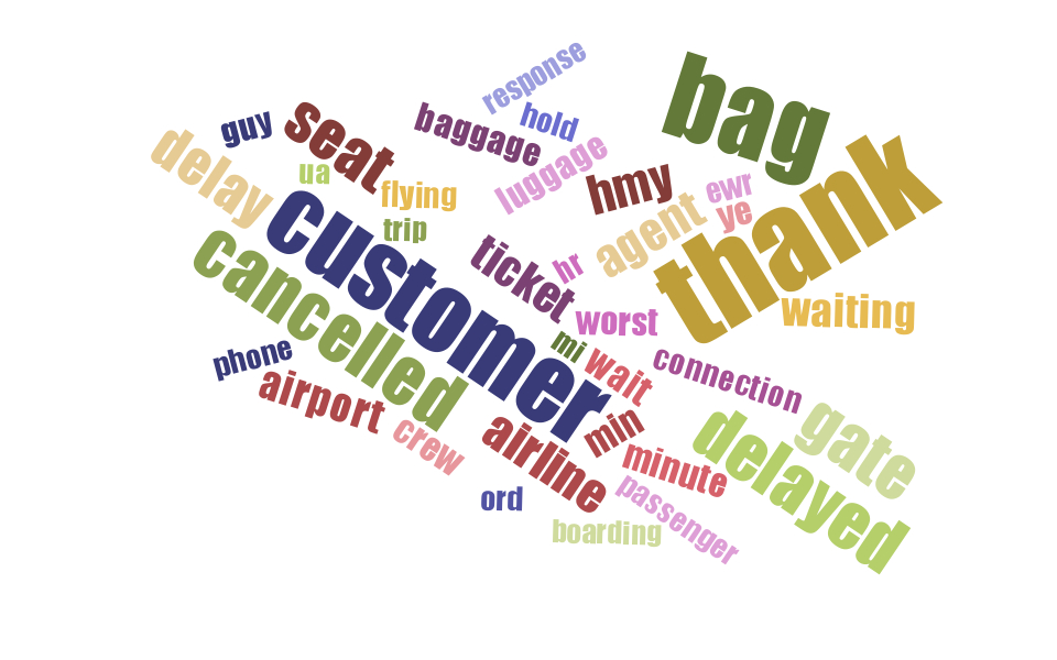
At first glimpse, we find words that can be considered expected when talking about an airline (i.e. seat, cancelled, ticket or airport) when looking at the previous figure - visualization of the top 40 most frequent words from the list of @united’s random tweets before the incident.
To be more precise, in our 3434 sample list of tweets the word thank/thanks is the most repeated with 340 appearances, others like bag or cancelled appear 288 and 191 times respectively.
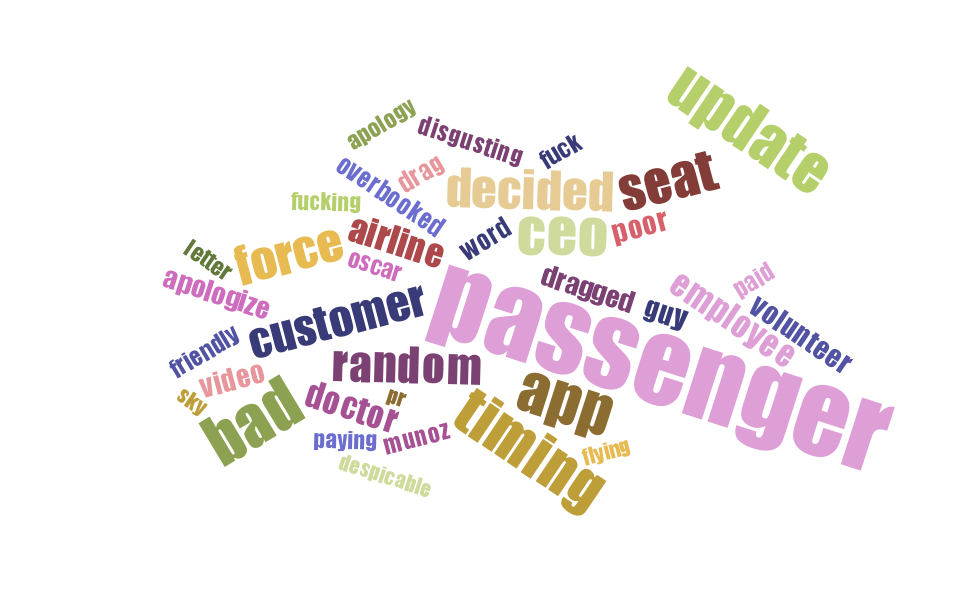
On the other hand, the word cloud with the most frequent words after the incident is dramatically different - passenger became the most repeated word with 344 appearances, but also other words with very bad sentiment like bad, fuck, apologize or dragged.
NLTK Freq
To create both clouds I made use of @jasondavies’s d3 word cloud generator tool and Python’s NTLK FreqDist class to encode frequency distributions.
from nltk.probability import FreqDist
from nltk.tokenize import word_tokenize

ignore_list = [".", ",", "", "...", "i", "--", "!", "'s", "?","(", ")", "a", "about", "an", "and", "are", "around",
  "as", "at", "away", "airlines", "airline", "be", "become", "became", "been", "being", "by", "did", "do", "does", "during", "each", "for",
  "from", "get", "have", "has", "had", "he", "her", "his", "how", "i", "if", "in", "is", "it", "its", "made", "make",
  "many", "most", "not", "of", "on", "or", "s", "she", "some", "that", "the", "their", "there", "this", "these",
  "those", "to", "under", "was", "were", "what", "when", "where", "which", "who", "will", "with", "you", "your",
  "erw", "united", "https", "https", "rt", "http", "amp", "u", "dm"]

def get_freqdist(df):
    fdist = FreqDist()
    # entropy_dict is a dictionary with word-entropy values
    entropy_dict = load_entropies()
    for line in df['text']:
        for word in word_tokenize(line.decode("utf-8")):
            try:
                if word.lower() not in ignore_list and entropy_dict[word.lower()] < 15:
                    singular = TextBlob(word).words[0].singularize()
                    word = TextBlob(singular).words[0].lemmatize()
                    fdist[word.lower()] += 1
            except:
                pass
    return fdist
With the FreqDist object obtained from the previous method we can return the most common words by calling the method most_common:
fdist = get_freqdist(df_before)
fdist.most_common(20) # return top 20
>> [(u'passenger', 344), (u'bad', 191), (u'app', 188), (u'update', 186), ...]
Sentiment analysis
Sentiment analysis is a method in NLP used to classify the emotion and subjectiveness of human language. This technique is commonly used to determine how customers feel about a particular product, in addition of other specific uses like financial securities (stock market) or political campaigns needed when creating tailored speeches depending on the public (region, background…).
Regarding our task, sentiment analysis is going to help us classify our list of tweets as positive, negative, or neutral in tone. Hopefully the process will include the detection of specific emotions inside the content of our tweets such as anger, sadness or excitement.
We are going to use TextBlob - a Python open source library for text processing, mainly because it stands on the strong shoulders of NTLK, but also because it has an easy-to-use sentiment method that can be applied to any TextBlob object. The method returns a tuple with two values:
- a polarity value with a range [-1, 1], indicating how negative or positive the text is (the closer to 0.0 the more neutral).
- a subjectivity value with a range [0, 1], indicating how subjective the text is (the closer to 1 the more subjective). TextBlob’s sentiment method is very basic and there is a lot of room for improvement, but for a simple and fast analysis like the one we are working on it should be good enough to help us get some rough results.
Starting by a sentence
Let’s randomly pick a tweet, get their sentiment and see what TextBlob returns:
TextBlob('This is how @united handles overbooking: DRAGGING PASSENGERS OFF THE PLANE BLEEDING FROM THE MOUTH. Never fly with @unite').sentiment
>> Sentiment(polarity=-0.4, subjectivity=0.9)
Seems pretty accurate to me that the sentiment of the previous text has a bad polarity (-0.4). On the other hand, sometimes TextBlob is not that good at detecting negativity in texts, which is a glaring problem for our analysis:
TextBlob('RT @girlsreallyrule: This is how @united treats their paying customers who refuse to "volunteer" to give up their seat when the airline').sentiment
>> Sentiment(polarity=0.0, subjectivity=0.0)
Conclusively, this method is limited and if we want to improve our analysis, we need to find a better method. Despite the previous problem, we can still plot revealing results comparing the before/after sentiment in our tweets with TextBlob.
If we save the polarity of each text as a new feature in our dataframe, we can display with displots the resulting sentiments from both datasets (the before and after) and visualize the distribution of the polarities.
df_before['sentiment'] = [TextBlob(t.decode('utf-8')).sentiment.polarity for t in df_before.text]
df_after['sentiment'] = [TextBlob(t.decode('utf-8')).sentiment.polarity for t in df_after.text]
fig, (ax_1, ax_2) = plt.subplots(1, 2, figsize=(12, 5))
sns.distplot(df_before['sentiment'].tolist(), label="before", ax=ax_1)
sns.distplot(df_after['sentiment'].tolist(), label="after", ax=ax_2, color="y")
sns.plt.ylim(0,10)
ax_2.legend()
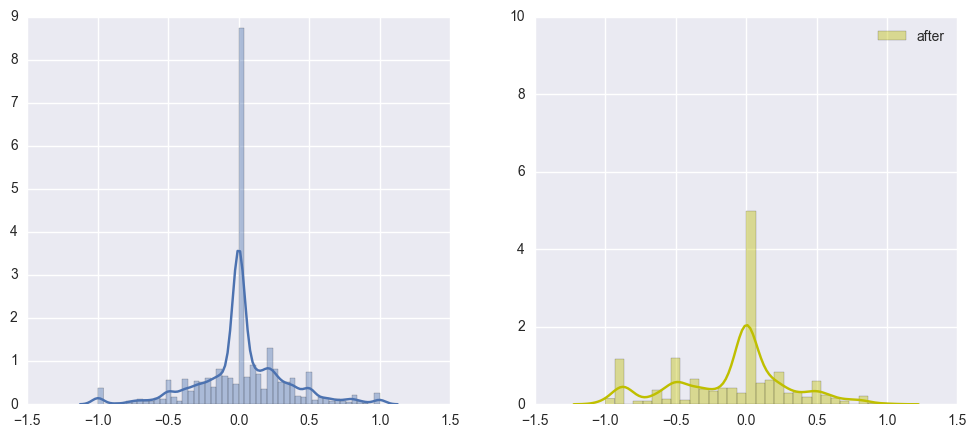
Well, it looks like the plot on the right (regarding the tweets after the incident) is not as smooth as the one on the left side. In addition, the plot in the left side (tweets before the incident) follows a parametric distribution with its mean equals to zero.
Let’s take one step further and classify the tweets as negative, neutral or positive. We are going to set 0.3 as our classification threshold, which means we will consider sentiment neutral tweets the ones with polarity between -0.3 and 0.3. Tweets above 0.3 will be considered positive while below -0.3 will be considered negative.
def classify_sentiment(df):
    result = []
    for sentiment in df['sentiment']:
        if sentiment >= 0.3:
            result.append('positive')
        elif sentiment < 0.3 and sentiment > -0.3:
            result.append('neutral')
        else:
            result.append('negative')
    df['sentiment_level'] = result

classify_sentiment(df_before)
classify_sentiment(df_after)

fig, (ax_1, ax_2) = plt.subplots(1, 2, figsize=(12, 5))
sns.countplot(x="sentiment", data=df_before, ax=ax_1, label="before")
sns.plt.ylim(0,2500)
sns.countplot(x="sentiment", data=df_after, ax=ax_2, label="after")
ax_2.legend()
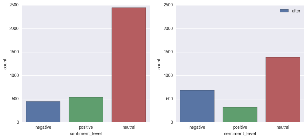
The previous two figures are countplots which visualizes the number of observations in each categorical bin using bars. This is a definitely better visual display to compare how drastically decrement the sentiment in tweets about American Air during the next days after Dr Dao’s incident.
Future steps
We can use a naive Bayes classifier, which is included in TextBlob, to create a better sentiment analyzer from our list of tweets. By only training a small portion of our data, we should be able to get better results than the previous sentiment method.
On the other hand, as I am pretty busy and already satisfied with the results of the previous analysis, I will let this task remain on my to-do list. Surely I will find some free time in the future and improve the analysis - if that happens, I will update this post with the results.